Sometimes a book has a title before the first word is written, I actually have a few of those in my back catalogue of ‘one day I’ll tell that story’.
The cover is often conceived during the writing process. Coming up with the words inside said cover has never been a problem for me, although keeping to the story can be. However, in the case of the last four books various aspects from headline title to back page blurb have occurred sporadically.
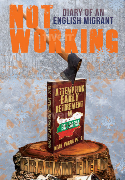
‘Not Working’ was a title that was a long time coming, but like looking for a house, partner or location when the right one comes you know that everything before was just part of the journey. However the title did become a bit of a self-fulfilling prophecy as just about every aspect of the book production was plagued with setbacks, many roads were dead ends and the journey to completion was not working.
The cover was a vague concept I came up with, but I can only relay my thoughts through words, drawing is not my forté. Having no graphic skills at all I took to Fiverr to employ a ‘cover designer’.
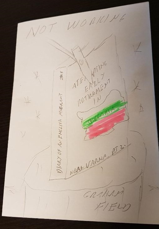
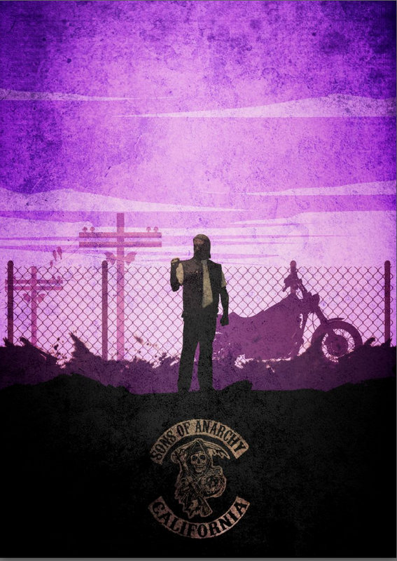
A tall order and time consuming practice, trying to find someone to create an image for a book they have not read and have no clue as to past covers. It wasn’t a secret, I tried to inform the designer in the brief but it went unread. As soon as you say ‘motorbike’, back comes a draft with ‘Sons of Anarchy’ or a Harley on the cover. No mate, that’s not working at all.
I wanted minimal, as the cover of part 1, ‘Near Varna’, could perhaps be described as a bit busy. But like writing a 300-word column, as I edit it down it keeps getting longer. So a simple illustration kept getting more complicated. Unfortunately my increasing desires and artistic demands were deemed unworkable.
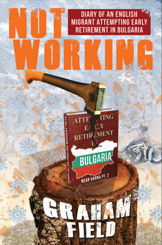
I want the axe to come down with force, anger, frustration.
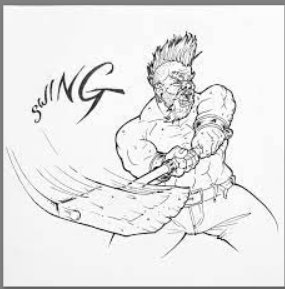
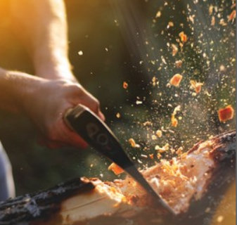
I want wood chips flying.
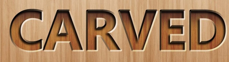
Can you carve my name into the chopping log?
Can it be in perspective?
If the title on the diary can be seen it won’t have to appear again on the page as a subheading.
I’m sure you can put an axe through a book without distorting the wording. I took to putting an angle grinder through a book to prove an axe needn’t make an indent in the text and it could still be legible.
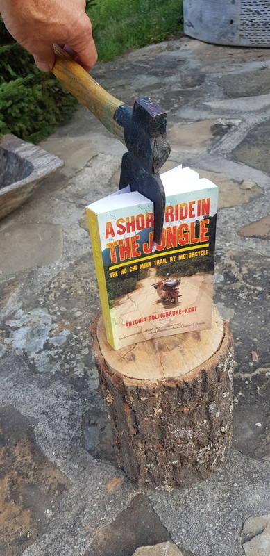
I didn’t want to deface a defenceless book. I had two versions of Antonia Bolingbrook-Kent’s book, the classy one she signed for me and the floppy print-on-demand low quality one, which was destined to become my guinea pig, the ultimate edit, the final cut.
Still the designer couldn’t quite get it right, so close in concept but so far from finished. I’m all for giving the artist the licence to create as they see fit but they do have to listen and be within the borders of restraint. If you would just read the bloody guidelines and not go so far left field that subject matter is not covered on the cover.
Ultimately, I surmised that there needs to be an element of chemistry between writer and artist. It’s not so much leaning towards leniency as trusting the visionary, believing that the image the artist has in mind will, when complete, like the title, leave you in no doubt that this is the only one that works.
And that’s what happened when Jonathan Fox got hold of the failing project, telling me graphic designers are 10 a penny, or more appropriately, abundant on Fiverr, but capable artists are harder to find.
First, he showed me an example of style.

OK that might work.
Then he created the model in real life and drew what he saw.

What he came up with was not what I had in mind but once seen my mind was made up. There was no ‘can you just’s’ because this was a vision, a creation born by reading my criteria, albeit between the lines, and doing what he wanted to in the first place. I’m OK with working that way, I don’t mind being led as long as I have confidence that the leader knows where he’s going.
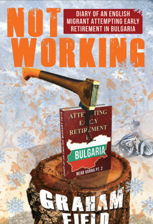
I was able to put my mark on it in places, but barely had to pull the ‘it’s my bloody book and I want it this way’ card. Then right at the end I heard ‘I’ve got a brilliant idea’ the not most reassuring of words, and the diary page background came into being. The transparency of minimalism was harder to see. I didn’t like it at first but I bounced it off people whose opinions I trust and it was unanimously declared the crowning cherry completion.

OK, but I want the diary page to be the 17th October as that’s the day the book starts, and that consequentially was how the release date was decided. At last something was working.
So let me explain. Every book I’ve written has had a bike or part of a bike on the cover, this one has a chopper. It covers the period of impending winter when preparation was paramount and riding was minimal. Preparing for that dormant season and all the things that went wrong ‘not working’ are the point of the prose. The nirvana I moved to was losing its rose-tinted romance as leaves and temperature fell, Mr. Frigid came to the village, cold radiated off the floor tiles. Wood was damp, the fire gave off more light than heat, my relationship was more heated than enlightened. Transport, body, career and house all ceased to function in accordance to my desire. There were a lot of things in my new life style that were not working, hence the chopping of wood was a splitting from the times that were depicted in ‘Near Varna’.
The spine was easy, ‘Near Varna’ had one stork in the nest, this one would have two and part three will have… well you’re already there.
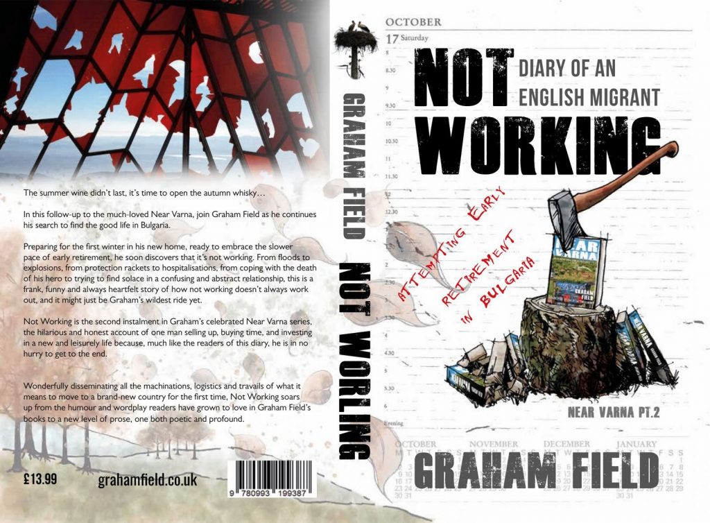
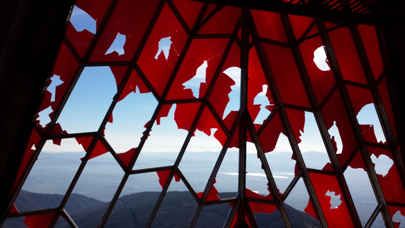
The photo on the back cover I won’t shed light on, it will all make sense when you read the book. Suffice is to say that shot cannot be retaken, that scene can’t be seen again. It was taken from the tower of the abandoned ex-communist headquarters called Buzludzha, that looks like a flying saucer atop a high Balkan peek. Entry is now forbidden; it always was, but now with CCTV and permanent security it’s impenetrable. With the fall of communism in ‘85 it was left to fall into ruin, it was not working, neither were the ‘No entry’ signs. Now, although still an imposing and impressive site, it can only be viewed from the outside. It was an exhilarating thrill to get in and go up but I think I’ve said too much, I don’t want to spoil it.
And that’s the cover story, I really like it, not exactly minimal but it turned out all white in the end.