AN E OR NOT AN E, THE UREKA COVER STORY
It went like this:
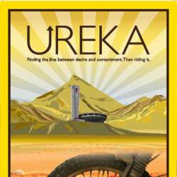
‘I’m seeing yellow, aren’t you?’ Said Paddy Tyson as we brain stormed a cover. We had just looked at about 20 other motorcycle travel book covers and discussed and analyzed them.
‘Ureka, it’s an epiphany, a flash of brilliance a ray of light, we need light’ he said
‘So it won’t be black then? Like, how black can it be?’
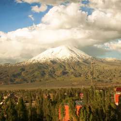
‘Yellow, and a lot of the journey was centred around Mount Ararat so let’s have that on cover, Eastern Turkey, Armenian, the Iran aspect of the book. Plus it’s the place when Noah’s Ark supposedly came to land when the floods subsided so that’s significant, land is essential in an overland journey.’
This seems to be one mans visions and I’m not about to interrupt him, he’s on a roll.
Then the eternal dilemma for any motorcycle book, do we put a bike on the cover? The argument being – if you have a bike on the cover it will appeal to motorcyclists but may alienate everyone else who would like it but are immediately put off, judging a book by its cover. However don’t put a bike on the cover and people with an interest in motorcycles will just pass it by. This was two years after my first book had come out, my name alone would not say ‘motorcycle travel’.
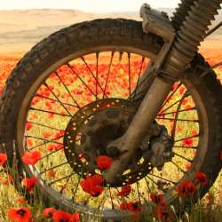
OK what about just a bit of a bike, something that if you know you know, and if you really know, you know it’s a KLR. We look as some photos I have of the bike, luckily being a solo traveller there is no shortage, as it stands in the foreground and in my opinion enhances most sites I’ve photographed.
‘The poppy one works and this year (2014) will be the 100 year of the anniversary of the start of the First World War so the poppy will be very relevant’ says Paddy,and then in full flow ‘lets make the epiphany light an Art Deco design to keep the 100 year theme’
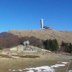
It’s all sounding great; I love this creative process, although to be fair my contribution ended with the completion of the manuscript. So we have the theme, the iconic mountain, the Art Deco epiphany, a bit of bike and the poppy theme which is relevant for many reasons, not least, that the journey took me into Iraq, Armenia, Georgia and former Yugoslav states. In fact what country didn’t have war in its history? Its poignancy is based on was it in living memory, the Ark landing wasn’t. There was one more thing we wanted to depict, the ex-communist countries I rode through and that’s when I came up with Buzludzha. The Bulgaria flying saucer shaped monument built to house the Bulgaria Communist Party. A place that can now be seen just a 5 minute ride from my house is but I didn’t know at the time I would end up living in such close proximity to this photogenic and symbolic structure.
OK technically it should be on the top of the hill but not Mount Ararat, its location on the cover is more about what it symbolised than accurate geographically location.
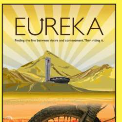
And that was it, all the ingredients were there. I can’t really take any credit for the cover it was the work and vision of Paddy Tyson but I love it, it’s a striking image and does justice to the story within.
Now why don’t we spell Eureka with a ‘U’ as in U-turn, as the story is about the U-turn on the edge of the Caspian Sea that bought about this Eureka moment. A spectacularly clever idea, and massive mistake, too damn clever. People who knew how to spell couldn’t find it in a Google search.
‘Eureka with a U’ it may of well be called, like ‘Lemmy from Motorhead’ it just needs a further explanation. So the reprint has an added ‘E’ but now everything is screwed up, ISBN numbers, Amazon reviews. It’s just a mess.
However the good news is that, in the about to be released Audio book version you won’t know, you can’t tell, the silent ‘E’ may or may not be on the editors floor. You be the judge.

